Estimated reading time: 8 minutes
Overview
Choosing between a Gantt chart vs timeline comes down to the altitude of your work. Gantt charts map out micro-level dependencies and critical paths, making them essential for day-to-day task execution. Project timelines strip away that clutter to show a high-level summary of major milestones, which is exactly what stakeholders and executives need to see. But for modern resource planners handling multiple overlapping projects, neither is enough on its own. You need a non-commodity approach: the visual clarity of a timeline built on the structural scheduling power of a Gantt chart.
At some point, you open your scheduling tool and realize it may be lying to you. The project looks perfectly fine on the screen, but in reality, your team is completely underwater. You find yourself staring at a screen, trying to figure out if you have the capacity to take on a sudden new client. But your current visual is either a tangled mess of overlapping lines or a roadmap so vague it is practically useless. This friction brings up a classic debate in resource and project management: when you need an accurate picture of your business, is a Gantt chart vs timeline the best choice?
Both track progress against time, but they operate at completely different altitudes. Choosing the wrong one does not just lead to messy reporting; it leads to misaligned expectations, accidental overbooking, and eventual team burnout.
Let’s look past the basic definitions and break down how these visuals actually impact the way you manage your most valuable asset: your people.
The core differences: what are you actually measuring?
To figure out which tool drives better results, you have to look at what they were fundamentally designed to do.
The traditional Gantt chart
Gantt charts were quite literally invented for the factory floor. Created in the 1910s by Henry Gantt to manage industrial manufacturing, they break a massive undertaking down into its smallest mechanical steps.
When you look at a Gantt chart, you see strict dependencies (Task B cannot start until Task A finishes) and critical paths. If you are building a skyscraper, you absolutely need a Gantt chart to ensure the foundation is poured before the steel is ordered. It is the ultimate tool for controlling the micro-mechanics of a single project.
But as a standalone tool for modern, knowledge-based work, a traditional Gantt chart has a massive blind spot. Because it was built for manufacturing, it treats human beings like fixed equipment. It maps the project’s timeline, not the person’s capacity. A Gantt chart might show a clean 5-day block for “App Design,” but it won’t tell you that your designer is also booked at 80% capacity on two other projects that same week. It focuses so heavily on the tasks that the people doing the work become invisible.
This doesn’t mean the Gantt chart is obsolete: it just means it needed to evolve.
The project timeline
A project timeline is the executive summary. It is a clean, chronological display that highlights project kick-offs, major milestones, and final delivery dates.
Timelines deliberately cut the noise. They do not care about daily task dependencies or individual assignments. Instead, they provide a scannable overview that immediately answers one question: “Are we going to hit our deadline?”
This makes timelines the perfect visual for the C-suite, clients, or external stakeholders. Executives do not need to see the friction of daily task management; they need a high signal-to-noise ratio. The downside is obvious: a timeline is practically useless for day-to-day operations. If a project suddenly flashes red, a timeline will not tell you who is overbooked or which specific bottleneck is causing the delay.
Making the right choice for your team
The “Gantt Chart vs Timeline” debate is not about one tool being objectively superior. It is about matching the visual to the audience.
If your primary job is strict, phase-by-phase execution for an isolated project, you need a Gantt chart. It will keep your workflow moving and your dependencies in check. If your job is to communicate high-level progress to a board of directors, you need a timeline.
But what happens if you manage a portfolio? What do you do when five different projects are pulling from the exact same pool of engineers, consultants, or specialized machinery?
This is where generic, commodity software fails. Most tools force you to choose: either wrestle with a cluttered task list or settle for a vague roadmap. To practice genuine project portfolio management, you have to break out of that binary.
Want the ease of drag-and-drop Gantt charts without losing sight of the big picture? Book a demo with our team to see how Ganttic makes it easier to plan, track, and optimize.
Moving beyond tasks: the resource-centric approach
The reality of modern management is that you shouldn’t have to choose between seeing your tasks and seeing your people. The solution is shifting your focus from managing the work to managing the resources doing the work.
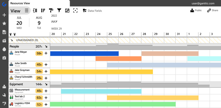
When you plan based on resource availability, the visual debate resolves itself. A platform like Ganttic is engineered specifically for this hybrid reality. It gives you the clean, horizontal clarity of a timeline, but instead of just listing project names on the left side of your screen, it lists your people, facilities, and equipment.
You can see exactly who has open capacity and who is stretched too thin with a single glance. At the exact same time, it gives you the drag-and-drop resource scheduling power of a Gantt chart, letting you reallocate work instantly when reality inevitably changes your plans.
Get started with the resource-centric approach now: Creating a Resource Gantt Chart
We see the impact of this visibility constantly. 40% of our users end up growing their companies and resource pools after implementing Ganttic. Our clients (whether they are designing houses, building lifeboats, or developing vaccines) prove that efficiency is not about micromanaging tasks. It is about understanding capacity.
When you have a highly accurate, visual picture of your plans, you stop reacting to emergencies and start preventing them. You can confidently promise deliverables because your system actually shows you the white space in your team’s schedule.
If you are tired of switching tabs between high-level roadmaps and messy task lists, it is time to change your perspective. By focusing on resource capacity planning, you ensure that your plans are not just theoretical, but entirely deliverable.
How Ganttic bridges the gap between Gantt charts and timelines
If you are trying to scale your operations, forcing your team to jump between a dedicated task manager and a separate roadmap presentation tool is a waste of time. You need a single source of truth.
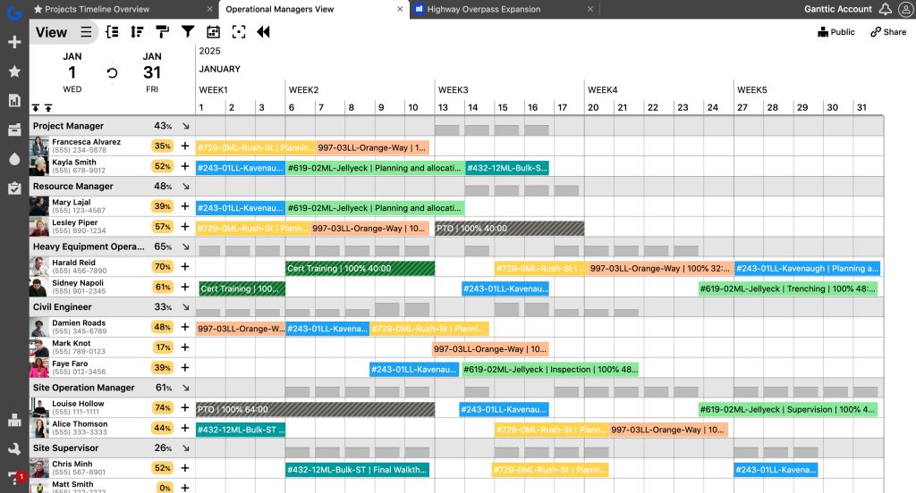
If you have ever researched Gantt chart alternatives because your current tool felt too rigid, you likely noticed that most software just gives you a different way to look at a to-do list. We built Ganttic to solve this exact problem by acting as a hybrid. We took the structural, scheduling power of an online Gantt chart and flipped the core axis. Instead of listing static project names down the left side of your screen, Ganttic lists your resources: your people, equipment, and facilities, as well as tasks and projects.
For your executives and stakeholders, this interface provides the exact high-level clarity of a traditional timeline. They can look at the dashboard and immediately see the long-term roadmap, upcoming milestones, and overall organizational capacity without getting lost in the weeds.
But you are not locked into that single perspective. Ganttic also features a dedicated Project View. When project managers need to actively run the floor, they can toggle their screen to see the traditional, project-centric breakdown. Here, the deep scheduling mechanics remain intact. You can still drill into specific assignments, link dependent tasks, and use drag-and-drop mechanics to adjust to sudden delays. By combining the macro-view of a timeline with the micro-control of an online Gantt chart, you bridge the gap between high-level project management strategy and actual daily execution. You get the visual roadmap to guide your business, and the granular data to make sure your team can actually get you there.
FAQ
The primary difference is granularity. A Gantt chart is a highly detailed view that maps individual tasks, dependencies, and critical paths for a specific project. A timeline is a high-level visual that shows overall project durations and major milestones, stripping away the daily task clutter.
No, because they serve different audiences. A timeline cannot replace a Gantt chart for a project manager tracking daily dependencies. Conversely, a Gantt chart may be considered too complex and noisy to replace a timeline for high-level executive or client reporting.
Neither a traditional Gantt chart nor a basic timeline is ideal for capacity planning. Traditional Gantts are project-centric (they track tasks), and timelines are too vague. We recommend a resource-centric visual that combines the high-level clarity of a timeline with the scheduling mechanics of a Gantt chart.
Ganttic acts as a hybrid solution that gives you a single source of truth. It allows you to flip the core axis of a traditional Gantt chart to list your resources (people, equipment, and facilities) alongside your tasks and projects for a clean, timeline-style overview of your capacity. Because you are not locked into a single perspective, you can easily toggle to a dedicated Project View. This gives you the project-centric breakdown where you can link dependent tasks and use drag-and-drop scheduling exactly when you need it.
Written by
Gökçe Karabay
Marketing Lead at Ganttic