One of the greatest pros of using resource scheduling software is that someone is doing all the math for you. You could draw Gantt charts on a whiteboard or plan your resources using Excel spreadsheets. Naturally, it wouldn’t be as comfortable as using the right tool but you could do it.
But no one would do the math for you. Maybe a Good Will Hunting type of situation would happen where a brilliant young mind would see your whiteboard and they would calculate the utilization percentages for you but let’s be honest it’s not very likely. That’s why this update is from start to finish about the utilization math our planning software is doing for you.
Nevertheless, Matt Damon is always welcome at our office!

CAPACITY UTILIZATION GRAPHS WITH A NEW SAUCE
We have had capacity utilization graphs to make your resource planning easier for quite some time. Now, we decided to tinker with them to make them a little better.
Firstly, since Ganttic is a highly visual planning tool, and we know how much you guys like to color code your tasks and projects, we made it possible for you to choose the different colors for the different utilization percentages and you can now choose the ranges yourself, too. Just go to General Settings Utilization.
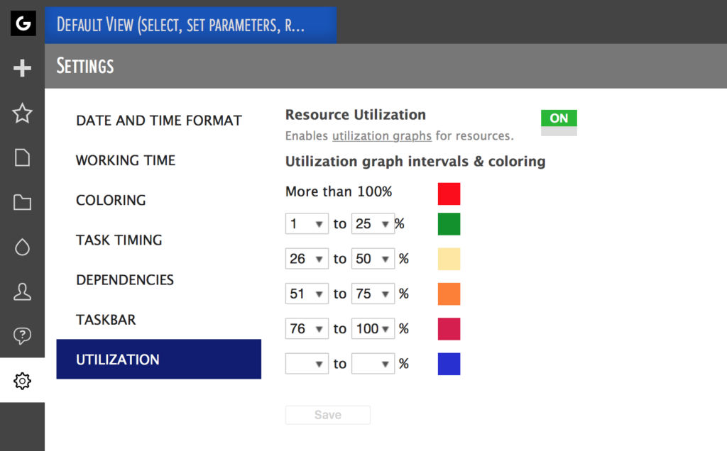 Resource utilization graph intervals and coloring
But that’s not the only thing that’s different. We changed the form a bit, too. Basically, utilization graphs are only displayed at the time that the resource is actually utilized. Meaning the graphs won’t appear as a continuous line on top of the task but in parts during resource’s working time.
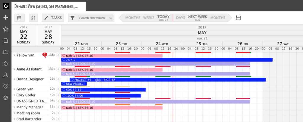 Capacity utilization graphs in the Gantt chart area
SOMETIMES IT’S THE GROUP NOT THE INDIVIDUAL
And now to the thing that’s completely new. Have you ever heard about the human-shaped stone monuments that are called Inukshuk? It’s a beautiful symbol of working together – by the means of how it was made and what it is. A number of people had to come together to build them, and every stone in the statue is a separate entity. The statue wouldn’t stand if each stone wouldn’t support and be supported by, the one above and the one below it. That’s how it is with your project team, too.
It takes a number of people to make them (based on the assumption they aren’t all brothers and sisters, hehe). Your projects are a success if each and every one of them is delivering the results you need. They can’t excel at their tasks if someone else is coming short. You have to look at them as a whole when you are planning tasks. You have to draw out all the dependencies.
You can’t pile too much work on one of them because when you do it others will suffer, too. They are one. They are a group. There are different combinations that make different groups but there always are groups. That’s why we are giving you group utilization.
 Inukshuk, pronounced in-ook-shook, are stone monuments erected in the image of humans
If you group your resources by any list type of custom data fields you have added, you’ll see the utilization of those groups. That means you can check the utilization percentages of different departments, locations, skills, etc. If you collapse all the groups, you’ll get a kind of a heat map in addition to the percentages.
That way, you’ll get a quick overview of the utilization of different groups. Can you take on a new project or is your development team’s utilization already at 100% at that time? Have you forgotten about a group altogether? That kind of questions won’t be just questions anymore. They’ll be questions with answers.
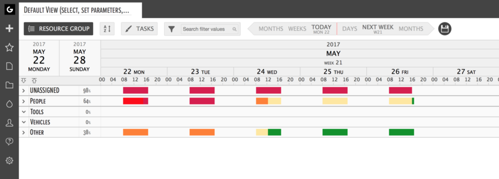 Group utilization percentages displayed next to the resource group