Colors have special powers. Without words or context, a new shade can give objects a different meaning or highlight severity. For example, red often denotes danger and urgency. While green might have the opposite effect, indicating peacefulness, calm, and safety. During the height of the pandemic, many countries adopted a color coded scale to illustrate the number of new daily cases relative to hospital beds. In marketing, colors can silently communicate your brand’s ethos, while also instantly making you more recognizable. And in project management colors can indicate status, priority, or simply help you stay organized.
Whether you want to give great context to your project and resource schedule, or you just want to spice your Gantt chart or Kanban board, adding some fresh hues is a great option. But before you get those paint brushes out, we put together a few of the most common meanings and associations colors hold. As well as a few proven ways why coloring your plans can be beneficial to your project team and the planning process. We also compiled a list of all the ways and steps for customizing your Ganttic planners with a full artist’s palette.
What Do Colors Mean?
Colors often have an unconscious psychological effect on us. Some of it is cultural associations people have – i.e. political parties and movements and flags. Religion and mythology can also contribute to how colors are seen and portrayed. Or even language can have an effect – expressions like “rose colored glasses” or “green with envy.”
Here’s a few more ways that colors can have an influence on us, with some of the most common color associations in psychology. And how that might be applied to the color codes you choose for project management.
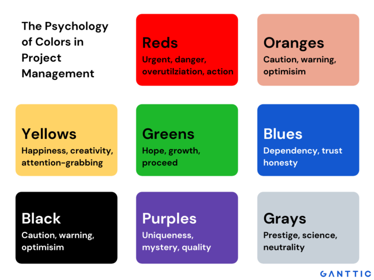
Red – passion, aggression, urgency, movement, excitement, action
Orange – fun, friendly, optimism, caution, warning
Yellow – happiness, creativity, attention-grabbing
Green – hope, growth, health, good to go, proceed
Blue – dependency, intelligence, trust, honesty
Purple – uniqueness, mystery, quality
White – purity, simplicity, safety
Black – exclusivity, power, elegance
Brown – durability, security, reliability
Gray – prestige, science, neutrality
Why Use Color Coding in Project Management?
Project management is all about making plans a reality. The tools, methods, and techniques may vary, but ultimately the goal is to streamline workflow and make it easier on the one doing the planning. Colors are just one more tool in the project management arsenal to help give you the edge. How?
- The majority of people are visual learners. This means that people retain information better with the help of visual cues. Just like using a highlighter, color coding tasks and project statuses can help emphasize what’s important. And it helps your team to not only pay attention, but remember.
- Colors can speak to different generations. Millennial pink and Gen Z yellow are 2 recent trends that can help you catch the attention of younger teammates. While baby boomers tend to gravitate towards more classic color palettes – dark blues, maroon, gray, and deep reds. Using color coded planners, may help you connect a multigenerational project team.
- Different colors can affect people’s stress levels and behavior. Red illustrates urgency. Orange is often used for call to actions. Yellow is the most eye-catching. While blue denotes trust. In planning, you can use colors to appeal to onlookers on a psychological level. Create a sense of priority for your team with a bold, bright color. Or if sharing project timelines with clients, use blue to build trust between yourselves.
- Many people are probably familiar with the RAG (red, amber, green) Traffic Light System in project management, even if they don’t know it by name. This method uses the colors of the traffic light as a way to illustrate project status. This system works because not only do most people recognize what these colors represent – danger, take caution, go – but they also unconsciously process these colors in particular ways.
- Customization in project management leads to project success. Research shows that a custom project life cycle and project governance creates more opportunities for success. Personalizable, user-centric project management solutions are an instrumental part of this. And part of this process involves tailoring colors to fit specific workflows.
How to Use Colors in Your Project Management Workflow
Using colors to schedule resources or track projects can take your planning to a whole new level. Here’s a few ideas on how to incorporate some splashes of color to your project resource management, as well as some tips on implementing the ideas in Ganttic.
Use Brand Colors to Personalize Plans
Create project plans that pop by adding custom colors. Make your resource schedule an extension of your organization with your brand’s color scheme. Or tailor a client’s project schedule with their own specific colors.
Develop a unique way to organize your project’s elements while adding some new shades to spice up your plans.
How to do this in Ganttic
It’s simple to create a custom color palette with the shades of your choice. Under Settings > Coloring you’ll find the planner’s color palette. Click on a square to tweak or add the color – either with the color picker or via the HEX code.
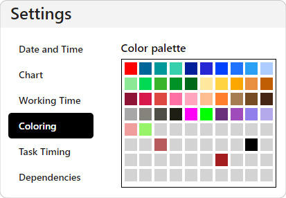 Find and customize your color palette in Ganttic’s Settings.
Saving this color palette means it can be used across the whole planner – as a way to highlight tasks, projects, and custom data fields, to showcase holidays and non-working days, to track utilization, and to emphasize dependency lines. Keeping everything consistent and unique.
Quick Color Coded Organization
The way in which each individual chooses to manage their projects and portfolio can be very personal. The combination of accepted methodologies, techniques, and tools amounts to millions of variations. But at the heart of every project and resource management strategy is the simple need for systemic organization.
Codes based on colors enriches any personal planning style. Maybe it’s necessary to highlight the projects run by different managers for a quarterly review. Or use it to get a quick overview of the various bookings in the resource schedule. You can also use colors to build a strategy by emphasizing which clients in your portfolio have the highest ROI.
How to do this in Ganttic
You can choose the color for each new project and task you create in Ganttic. But on your Gantt chart, you can decide if you want to see the actual bookings colored according to the individual tasks, projects, or your Task and Project Data Fields – this is called conditional coloring. Navigate to Taskbar coloring for all the options.
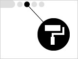 The Taskbar Coloring icon in Ganttic
Tip: Different Views can be created and saved for each scenario. There’s no limit to the number of Views you create, so go wild!
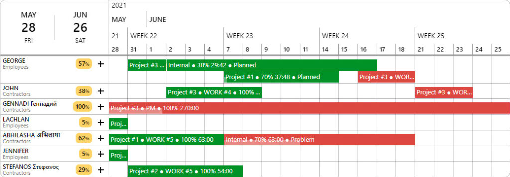
Color Coding by Tasks
Need a quick rundown of all the ongoing scheduled tasks? Then choose “Task Colors” as a way to color your Taskbars and bookings. Each individual task color can be customized in their task dialog window when editing a task. And copied tasks will always have the same hue.
Color Coding by Projects
If projects outweigh individual tasks, then go with “Project Colors.” All tasks connected to the same project will take on the same color. This can be further customized and changed in the Project Edit Dialog when editing a project. With this option you get a bigger picture of the complete portfolio.
If you’ve defined projects to represent specific clients, then using this method will provide an overview of all the work going on clients. Alternatively, if your projects represent a job site, goal, or something else, that logic will apply. However, you use them, Project Colors can be a useful tool for highlighting what’s important.
Color Coding by Data (Conditional Coloring)
Want to see the workload of your project managers? Or what one department is doing in comparison to another? Then choose a coloring option based on either your own Task or Project Data Fields. For this, any List-type and Check-type Data Fields can be used.
Customize the color of the Data Field Values in the Taskbar Coloring dialog or when editing the Data Fields.
Gain an Overview of Progress & Status
Sometimes the how is more important than the what. In some instances, it may not be necessary to know what your team is working on. Instead, you just need to quickly check on how something is progressing.
Is an assignment on hold? Was a certain milestone reached? Is the project already completed, but waiting on a sign off from above? Color coding certain data can be a quick way to get a status update on a project or task to get a better idea on how the work is progressing.
How to do this in Ganttic
In Ganttic, it’s easy to color code the status of projects and tasks for quick viewing on the Gantt chart. Accomplish this via the Data Fields feature and the conditional coloring option discussed above.
Start by opening your project or task for editing, and clicking “Data Field.” Choose List-type Data Field then add a few status categories that make sense for your plans. For example you might choose: planned, in progress, on hold, completed.
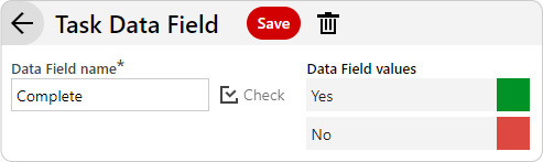
You can also add the Check-type which creates a binary choice that you simply check for each completed task or project. For example, below we named the Data Field “Complete” and entered “yes” or “no” as the 2 values. Then edit your tasks with the appropriate Check, or lack thereof.
 Data Field Values can have unique colors – allowing you to color code by status.
Whatever Data Field type you choose, the next step is the same. Once your tasks and projects are updated, click on “Taskbar coloring” on the View’s toolbar. Choose the task or project Data Field you’d like to highlight and hit “Apply” or “Apply and Save.”
In the Gantt chart, you will get a color-coded view of what’s been completed and what still needs to be done. Adjust the colors as needed, you may just need to hit “Refresh” for the planner to reload each new color scheme.
 Get a quick overview of which tasks are finished and which are still ongoing.
You can share this newly created View with your team or even your clients. Just hit the “share” button in the top right corner. This will generate a non-editable View that can be shared with anyone via a URL.
Tip: Project status can also be used as a way to create Kanban boards. In fact any list-type Project Data Fields can be used to organize projects on a Kanban board, offering yet another way to view your data. Add color to your Kanban by editing the Project data field.
Highlight Holidays and Non-working days
Project management is the sum of a lot of diverse parts. Not only is it mandatory to take into account the projects and their timelines, but it’s necessary to keep an eye on changing client demands, resources assigned to projects, and external occurrences – price increases, world events, even holidays.
National holidays and Bank Days are going to slow down workflow. And it’s crucial to recognize if there’s a long weekend coming up, as well as making the proper adjustments when your team members start blocking off vacation days.
How to do this in Ganttic
You can personally pick the color for all non-working days and Holidays in Ganttic. Navigate to Settings > Coloring. You’ll see the place to choose the hue for both Non-working Days as well as Holidays – these can be tasks you’ve defined as a Holiday (PTO, vacation days, company retreats) as well as national holidays you load into the planner.
Here is where you can also adjust the transparency of these days on the timeline. The number indicates how transparent you want the shade (1 is darkest, 9 is faintest) and the preview colors will change accordingly.
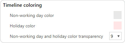 Choose the colors you want to represent working, non-working days, and holidays.
Taking a break from work can actually increase your productivity. Yet, even still almost 75% of Americans don’t take their paid holidays. See a few ways how sipping cocktails on a beach can positively impact those projects.
Indicate Resource Utilization
When it comes to project resource scheduling, overbooking resources can have some serious consequences – pushing projects back, causing delays, and creating bottlenecks in the workflow. Similarly, over-utilizing your resources can lead to poor quality work, burnout, and increases the chances for small problems to spiral out of control.
Tracking resource utilization is a way to see not only how much resources are being used, but helps ensure that there’s no double-bookings. Adding a splash of color is just another way to further highlight utilization.
How to do this in Ganttic
Whenever you book a resource to a task, their utilization will change on the Gantt chart. Utilization is represented by a colored bar graph above the assigned task bar. Or shown as a percentage when hovering over the utilization bar.
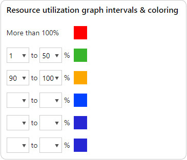 Choose the colors you want representing different utilization intervals.
This can be turned on and off, as well as customized under Settings > Utilization. Adjust the default percentage intervals and change the color of each. You’ll have a more complete picture of each planning element that will decrease costly mistakes.
Emphasize Workflow via Task Dependencies
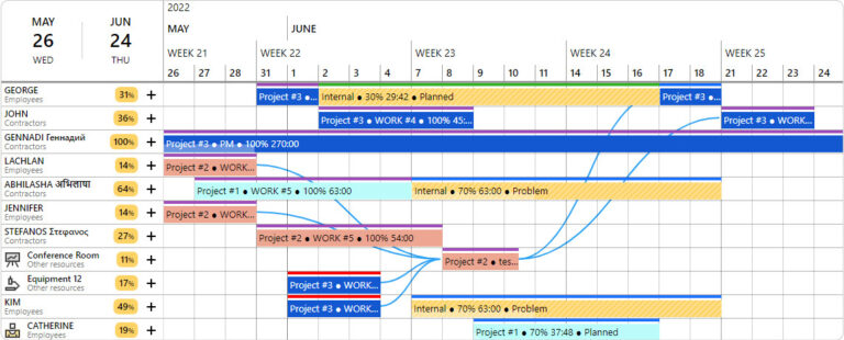
You can’t build a house without the foundation. In project management it’s often crucial to determine what needs to happen first before proceeding. To help with this, Task dependencies on a Gantt chart can illustrate the order of your work. By linking tasks together, you’ll know exactly what should be finished up before moving on to the next task.
How to do this in Ganttic
Simply navigate to Settings > Dependencies. There you can turn dependencies on and choose the color you’d like your dependencies’ lines to be. Pick a contrasting color to really make your dependencies pop. Or go with something more neutral to cut down on extra noise.
A Golden Opportunity for Better Project Resource Management
 Create a more colorful planner with Ganttic.
However you choose to incorporate color into your project plans, rest assured that some fresh shades will not only liven things up, but can have some pretty tangible benefits. Take the chance to customize your planner, but also your workflow. All while expressing yourself.
If you have any ideas as to other areas you’d like to see some custom coloring options let us know. Or if you want to share some unique ways you add some pop and pizzaz to plans, we’re all ears! Send us some screenshots to marketing@ganttic.com and we’ll share your unique color schemes on social media.