Ganttic is all about visual resource planning. That’s why so many of you guys love Ganttic, right? You can drag and drop Gantt charts. You can color code your schedules. You can use filters and timeline navigation to form different views and you can use multiple views to get a complete picture. You can generate reports to get a grasp on everything that’s going on while analyzing and optimizing each project and resource.
However, we think you have been secretly been waiting for a visual reporting option. Numbers are great for analyzing but sometimes you just want a quick overview at a glance. We hear you. We see you. And now we want to get graphic with you. You know…while reporting.
Without further ado, you might have guessed it, you might have seen it on our Twitter page, there’s something new on the sidebar. It’s visual reporting.
How Does it Work?
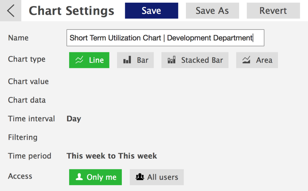
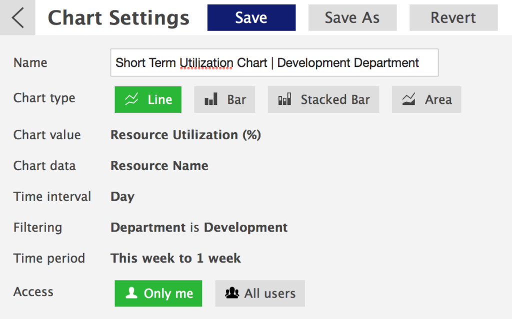
The visual reports are very similar to regular reports in the way they work. Once you click on the visual reporting icon on the sidebar, the first thing you can see is the list of report templates. If you click to add a new one, you’ll see the chart settings panel.
You can choose the chart type, name your chart, and choose if it’s a private or public chart (meaning only you can access it or your whole team can see it). You can create line, bar, stacked bar, and area type charts.
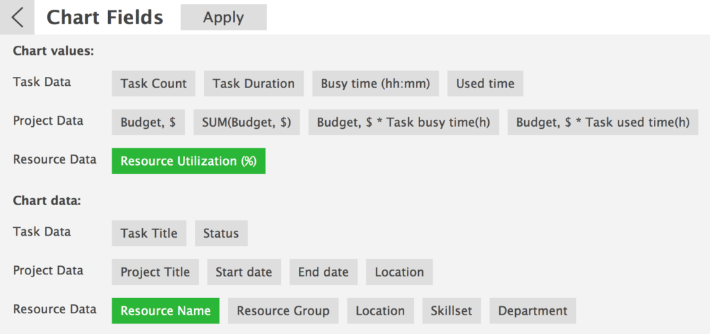
The next step is choosing the values for your chart. The first section, the chart values, is the data that’s going to form the chart. The second section, chart data, is the data that’s used for grouping the values.
You don’t actually have to choose anything from the second section. If you decide not to, you’ll see all the values that relate to the tasks you have planned for the period, and the data will be grouped by tasks. In fact, all the values you can choose are task data, and you can group them using the task, project or resource data.
As an example, we are going to generate a utilization chart for the development department to keep an eye on the short-term utilization. To do that, we are going to select resource utilization percentage from the chart values section and resource name from the chart data section. Since it’s a utilization chart for the development department, you might be tempted to choose the department from the chart data section but since we want to see the utilization of each member of the development team, we are choosing resource name, and adding a filter later. If you have selected the values and the data you need, select apply.
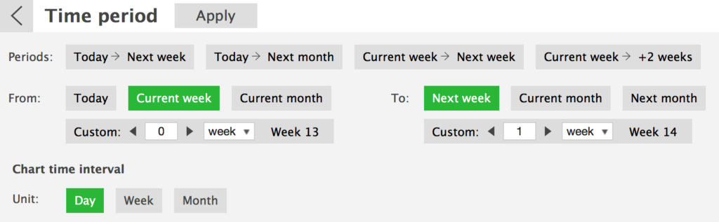
Now, it’s time for filtering. Filtering works the same way as it has always worked. Just start typing the thing you need to find, and options will appear. Since we only want to see the utilization of the development team, we are going to filter out the department. Once done, select apply.
The last step is choosing the time period for the report. Depending on the time period you would like to see, and the time interval you want the data to be grouped by, make your selections. Since we wanted to keep an eye on the utilization in the short run, we are going to select the current week and the next week, and we’ll set the time interval to a day. Again, make sure to click on ‘Apply’ once you are done.
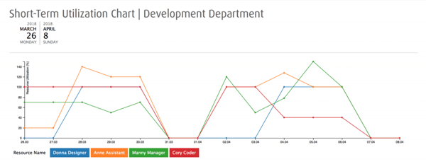
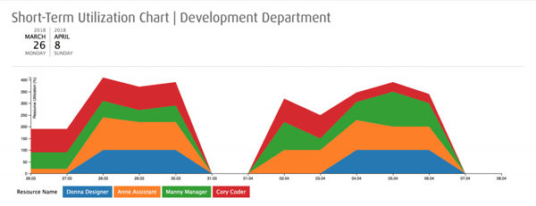
After clicking on ‘Show chart’, based on the selections that we made, we get a line chart that looks like this:
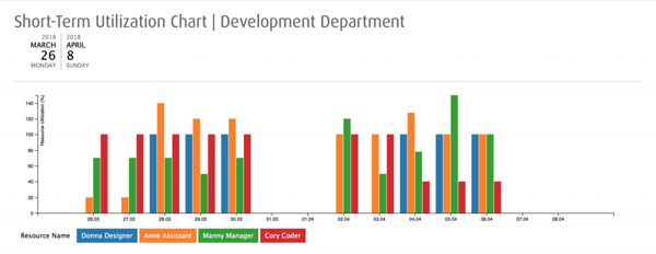
Now, as mentioned, you can change the type of the chart after making the other selections. For example, this is how our short-term utilization chart looks like as a stacked bar chart:
And an area chart:
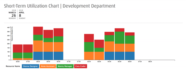
And as a basic bar chart:
For our goal, the last chart type works the best. For example, we can clearly see that Anne is overloaded on several days this week and on next Wednesday as well. The report can be used to show the higher level management that a resource needs to be allocated to help Anne out to optimize the workload. We can also see that a design assignment can be added to Donna’s timeline since she has no tasks on some days. And we can see that a resource needs to be allocated to help out Manny next week etc.
Once you have found the chart type that best suits your data, go back to the chart settings, and click on ‘Save’. Once you have done that, you’ll have what we call a report template.
Now, every time you need to see the short term utilization chart for the development department, you can just click on the chart’s icon on the sidebar, and select the report from the list. If you click on ‘Show report’ a bar chart with the selected data will be generated for the time period you have chosen. No need to go through the trouble of selecting the fields again etc.
How to Use It
As always, it’s all about your data and what you’d like to see. It’s an easy tool to use for getting an overview of a specific part of the resource plan. You can use the feature to report to upper management. If you are the upper management, you can use the charts to summarize the data and to make financial decisions. As a manager, you can decide if the department or the team can take on a new project. You can see if you need to take on new resources to optimize the workload. You can see where the resources need to be reallocated.
You’ll get the most out of the charts, is if you build up multiple templates. You can save a template after creating it and find it in the list of charts. You can have a whole list of different chart templates ready to be generated into charts. If you need to get an overview in a chart form, you can just select the chart you need from the list and display it using the magical ‘Show chart’ button.
Since the charts are generated based on your data, there are no rights and wrongs here. You can generate charts using the fixed fields like project title and busy time or custom data fields you have added. If you choose the latter, you can create charts based on task or project statuses, you can generate charts to have an overview of the workload of a specific manager etc. Go play around, and see what works the best for your needs!